In this issue, we will talk about the need for unbundling of the Business Intelligence layer. The lack of love for the semantic layer (relative to visualization) has been a net negative for data professionals.
We will look at example of a data visualization from McKinsey. This chart will highlight what makes a visualization pop. The answer – creativity and going beyond the norm.
A couple of data leaders are highlighted. We will wrap up with some interesting links and tools.
The BI Metrics Layer
Business Intelligence tools can create impressive charts. One of other strengths in the ability to generate SQL on the fly. This is often not appreciated by many. Generating optimized and database vendor-specific SQL code is a non-trivial task.
Ben Stalin in this excellent article looks at evolving aspects of the modern data stack. [@bennstancil](https://twitter.com/ bennstancil)
He highlights the need to unbundle the BI stack particularly the semantic layer. He calls it "metrics layer". I couldn’t agree more. An interoperable semantic layer will reduce development time.
There are two problems with the existing bundled BI stack.
-
Cost – As a BI product matures and moves into the "Enterprise" it gets acquired. Prices go up for the customers (example Tableau).
-
Speed of innovation – A bundled BI products have many priorities. The improvements in seemingly unglamourous semantic layer gets less priority. Business Objects offered a virtual "Database Connection". This could be swapped or changed in their semantic model. It took Tableau 15 years to release this feature.
This insight also highlights what is missing in the data world. Lack of coordination among vendors. The reason why SQL is popular is that the same (or similar) works across databases. Unfortunately, the current standards, for the most part, begin and end with SQL syntax.
Getting to this goal of a common semantic layer, may remain a wish list. For both vendor competition and technical reasons. (How does that open semantic layer ensure each vendor’s charts and interactions are delivered in the most optimized way?)
Data Tools
You may have 10 different tools in your not-so-modern data stack. If data is incorrect, it does not carry weight. The solution?
Great Expectations.
Well, that’s the name of the tool. It blends in well if you use declarative or code-driven data pipelines such as with using Python or dbt.
"Great Expectations is the leading tool for validating, documenting, and profiling your data."
Data Visualization
This chart about global greenhouse emissions places an image of the cow in the second place in a column bar chart.
Steve Wexler does highlight that the chart violates the so-called "best practices" of data visualization. He also applauds them for making "accurate comparisons" and their originality. This chart continues to prove that original and creative designs will appeal in an increasingly AI-driven world.
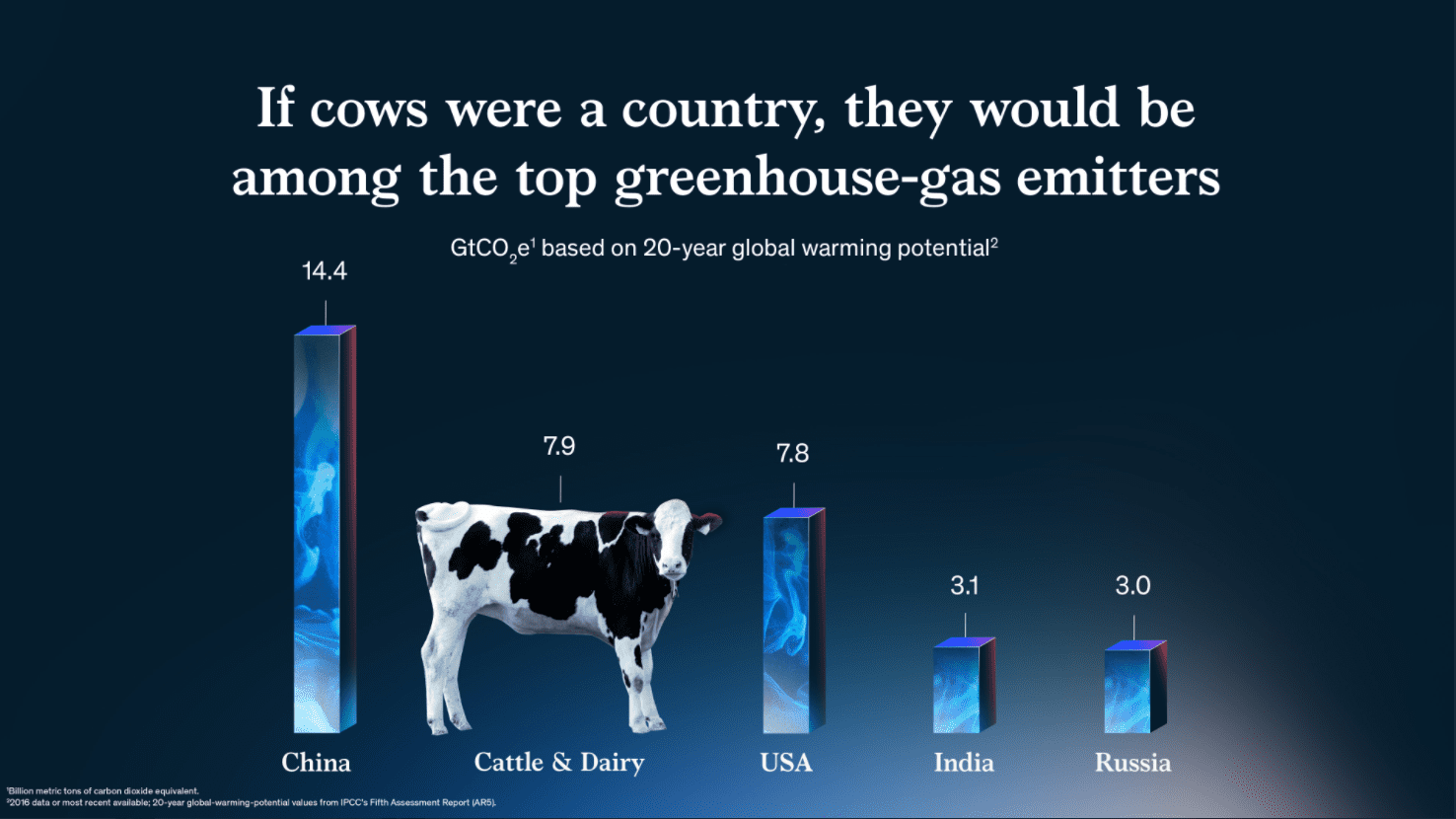
Image Credit @McKinsey
There are at least 50 different ways, an egg can be "cooked". Data drill down is not too far off. Rosario Gauna @rosariogaunag shows us 15 different ways of drill down with examples in Tableau
Featured Data Leaders
Teneika Askew @teneikaask_you has beginner level tutorial video on how to visualize your LinkedIn profile data. She is active on Twitter. She hosts spaces and webinars on career opportunities in data. Give her a follow.
[lyte id=’cWCY0hUxmOI’ /]
https://www.youtube.com/watch?v=cWCY0hUxmOI
Another leader you may want to follow is Stephen Levin @smlevin11. He has worked for Zapier and creates interesting content.
Interesting Links
If you like data and podcasts, Victoriano Izquierdo @victorianoi has you covered. He has compiled a list of data podcasts and their metadata.
Please do not hesitate to hit ‘reply’. I would love hearing from you.